 By
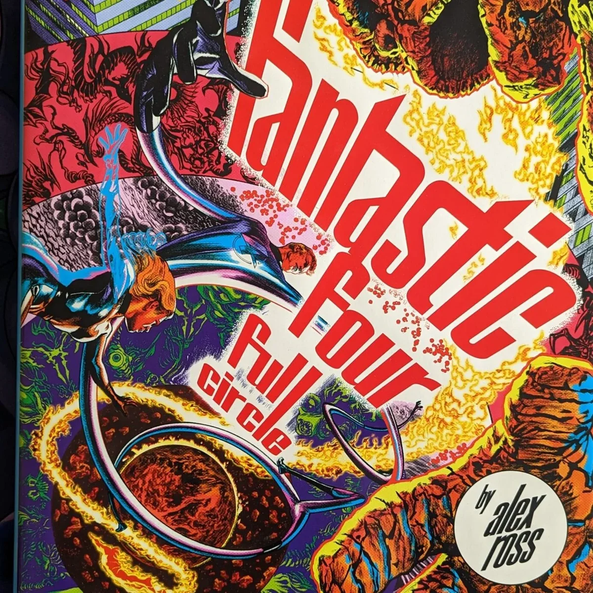
What can I really say? Alex Ross's art is unmatched, and in Fantastic Four: Full Circle he really shines. The biggest standout for me is his use of colour. The palette in this book is something else, and the artwork was such a highlight that it's what I want to talk about most.
What Full Circle is
It's a 64-page hardcover from Abrams ComicArts, part of its Marvel Arts line, released on 6 September 2022. It's also Ross's first long-form book as both writer and illustrator.
The story picks up from "This Man… This Monster", the 1966 Fantastic Four story by Stan Lee and Jack Kirby. On a rainy night in Manhattan, parasitic creatures made of Negative Energy get into the Baxter Building through a human host. To find out who's behind it, the team has to head into the Negative Zone, the antimatter universe Reed Richards discovered.
The plot itself is fairly simple. ComicBook.com called it a direct sequel to Fantastic Four #51 that fits the spirit of the Silver Age comics behind it. One nice extra: the front flap of the jacket unfolds into a newly painted origin story of the team.
Alex Ross's colour palette, up close
If you know Ross, you probably know him for fully painted pages with realistic heroes and dramatic lighting. Full Circle goes a different way. He inks his own lines with a brush, and the colour works around that linework.
He explained the process to Publishers Weekly. Ross normally paints everything himself, so he doesn't usually work with a colourist. Here, he made complete marker colour guides over copies of every page, deliberately leaving out modern shading so the book would hold up as if the digital paintbox didn't exist. He also studied the printed comics of Jack Adler, whose lighting effects and colour choices he admired.
He was also open about where the look came from:
"My blacklight poster pretensions were a driving ambition in search of a plot to hang them upon." (Alex Ross, Publishers Weekly)
The Negative Zone gave him the place to do it, and that's where the palette goes wildest. For me, this is the highlight of the whole book. Here's how the colour plays out across the book:
- Flat colour rather than painted blends, which ComicBook.com says leaves every page brimming with energy
- A blacklight-poster palette in the Negative Zone, soaking those pages in its strange, hostile atmosphere
- Black, white and grey tones that echo the photo collages Kirby used to drop into his comics
- Opening splash pages built from swirling blues and whites
- Stippled dots used to show energy, a nod to Kirby's trademark "krackle"
The Comics Journal describes it as a four-colour approach that favours blocks and harsh gradients over natural mixes. Crucially, the colour never overwhelms the linework. It sits underneath the black inks, so Ross's drawing always leads.
A love letter to Kirby
All of this ties back to Jack Kirby. Ross told Publishers Weekly that Kirby's collage art influenced his work here, and that he wanted to stop just short of directly imitating Kirby's drawing style. ComicBook.com spotted the touches: Reed's wide, square jaw, Kirby-style tilted panel angles, and two-page spreads with diagonal layouts where characters break through the panel borders.
The Comics Journal makes the same point, saying Ross taps into the maximalism Kirby put into his original art. Even the settings play along, with tilted views of apartments-turned-laboratories that seem to stretch in every direction.
If you've only seen Ross's painted work, this is a very different side of him. Have you read Full Circle, or do you know Ross best from the painted pages of Marvels?